
Device Screen Simulator
Test how your website or application looks on different devices with realistic frames. Enter a URL and select a device preset or custom resolution.
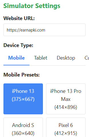
Simulator Settings
Device Preview
Common Device Resolutions
🖥️ Screen Resolution Simulator – Test Any Screen Size Instantly
In today’s multi-device world, it’s essential to ensure that websites look and perform perfectly across various screen sizes. Whether you’re a web designer, developer, or business owner, testing your website on multiple resolutions is a crucial part of responsive design. That’s where the Screen Resolution Simulator tool by EarnApKi.com comes in!
🌐 What Is a Screen Resolution Simulator?
A Screen Resolution Simulator is a web-based tool that lets you test how a website looks on different screen sizes and resolutions. Instead of manually resizing your browser window or buying multiple devices, this simulator replicates the experience for desktops, tablets, and mobile devices.
🔧 Features of Our Online Tool
Our simulator is designed for developers and non-tech users alike. It’s:
- ✅ Fast and responsive
- ✅ 100% free to use
- ✅ Compatible with all major browsers
- ✅ Covers all popular resolutions like 360×640, 768×1024, 1366×768, 1920×1080, and more
- ✅ Works on any device
👨💻 Who Can Use It?
This tool is perfect for:
- Web Developers who want to test responsive layouts
- UI/UX Designers ensuring pixel-perfect consistency
- Students & Learners practicing website design
- Bloggers and Marketers optimizing content for all audiences
- QA Testers validating browser compatibility
💡 How to Use the Tool
Using the Screen Resolution Simulator is extremely simple:
- Open Screen Resolution Simulator
- Enter your target website URL.
- Select a resolution from the dropdown.
- Click simulate and see your site in that screen size.
It’s that easy!
🔗 Internal Links
Explore more helpful tools:
🌍 Outbound References
📱 Why Use This Screen Resolution Simulator📱 Why Use This Tool?
Responsive web design isn’t just a trend—it’s a necessity. More than 50% of internet traffic comes from mobile devices. If your site doesn’t adapt well to various screens, you risk losing visitors and revenue. This tool lets you simulate the real experience and fix issues before going live.
🙌 Final Thoughts
Our Screen Resolution Simulator at EarnApKi.com helps you take the guesswork out of design. See how your site appears to users on various screen types and make adjustments on the go. Whether you’re building from scratch or maintaining an existing site, this tool ensures your design is truly responsive.
Try it now — it’s free, fast, and browser-friendly!